
")
")
")
")

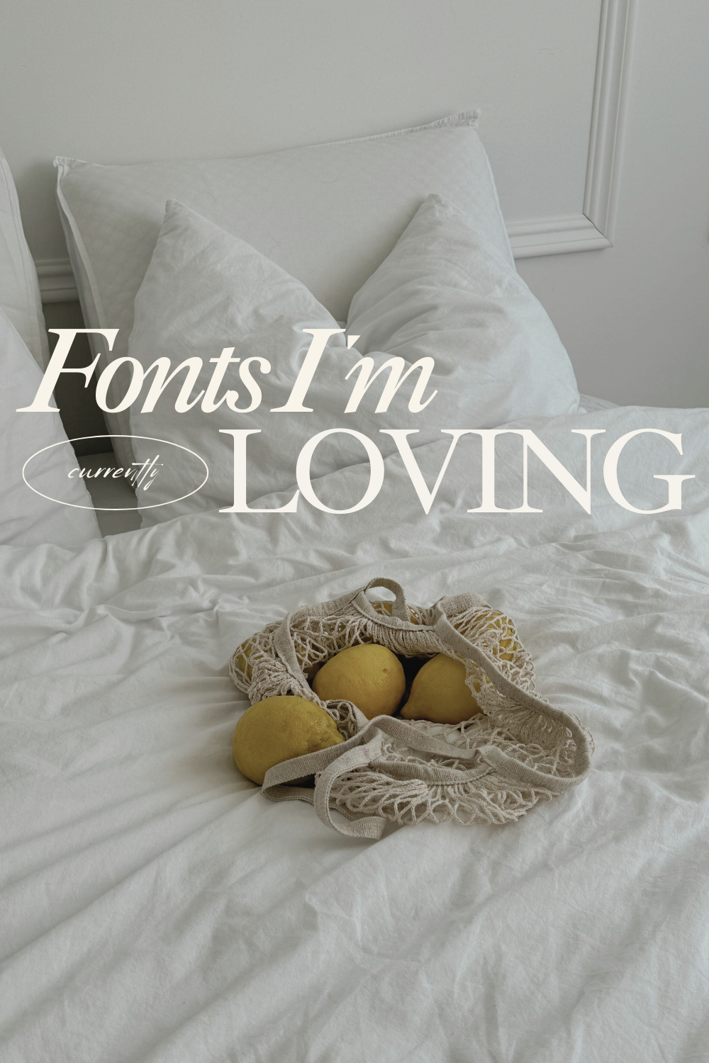
Unique free font pairings to elevate your brand
As a female online service provider or coach, your brand’s visual identity is crucial in making a great first impression and connecting with your target audience. The fonts you choose to represent your business can significantly impact how potential clients perceive your professionalism, expertise, and overall brand personality.
Selecting the right font pairing doesn’t have to be complicated or expensive. In this post, I’m sharing 4 free font combinations that are sure to give your brand a polished, elevated look.
Why Font Pairings Matter
The fonts you select work together to create the overall aesthetic of your brand. A cohesive font pairing can help convey your brand’s tone, whether that’s warm and approachable or modern and sophisticated. Thoughtfully choosing your fonts also ensures consistent branding across all your marketing materials, from your website and social media to your email newsletters and client proposals.
How to Choose the Perfect Fonts
When selecting fonts for your brand, consider the following factors:
- Brand Personality – Is your brand feminine and elegant or bold and edgy? Choose fonts that reflect your unique personality.
- Readability – Make sure your chosen fonts are easy to read, especially for large blocks of text like website copy and email content.
- Versatility – Pick fonts that work well for headlines, body text, and other brand elements.
Now, let’s dive into 4 stunning free font pairings perfect for female online service providers and coaches:
1. Cyrene & Gravity
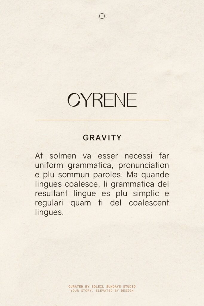
The pairing of Cyrene for headlines and Gravity for body text creates a harmonious blend of classic and modern typography. Cyrene, with its elegant serifs and varying stroke weights, lends a touch of sophistication to titles and headings. Its graceful curves contrast nicely with Gravity, a clean and contemporary sans-serif font used for the main text. Gravity’s geometric forms and balanced proportions ensure excellent readability, while complementing Cyrene’s more ornate style. This combination strikes a balance between traditional and current design aesthetics, making it suitable for a wide range of applications from editorial layouts to corporate communications.
Where to find these fonts:
Cyrene: Cyrene is a free typeface designed by Agostinelli Riccardo. Find it here.
Gravity: You can find this font on a few sites, like this one.
2. Godia & Public Sans
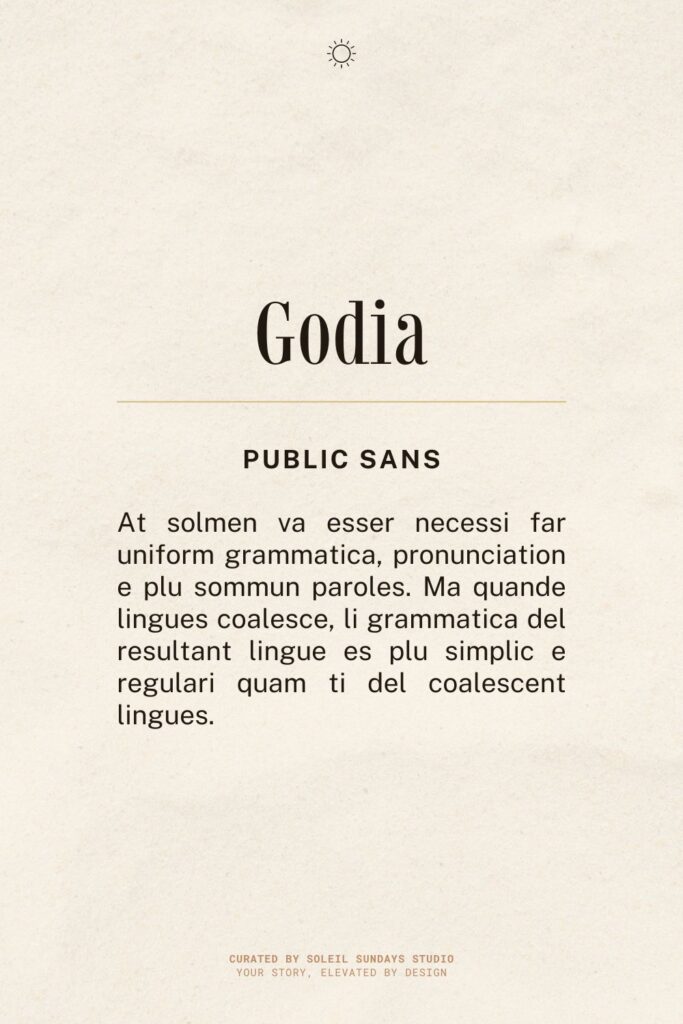
The combination of Godia for headlines and Public Sans for body text offers a striking contrast between decorative flair and functional simplicity. Godia, a display font with elegant, sweeping lines and artistic letterforms, brings a touch of sophistication and uniqueness to titles and headings. Its ornate style creates visual interest and draws the reader’s attention. In contrast, Public Sans, a clean and highly legible sans-serif font, provides a neutral and efficient vehicle for delivering body content. This pairing balances the expressive nature of Godia with the clarity and versatility of Public Sans, making it suitable for modern designs that require both personality and readability.
Where to find these fonts:
Godia: This font is designed by Daniel Gamage, and you can download it here.
Public Sans: Download on Google Fonts.
3. Nightingale & Junction
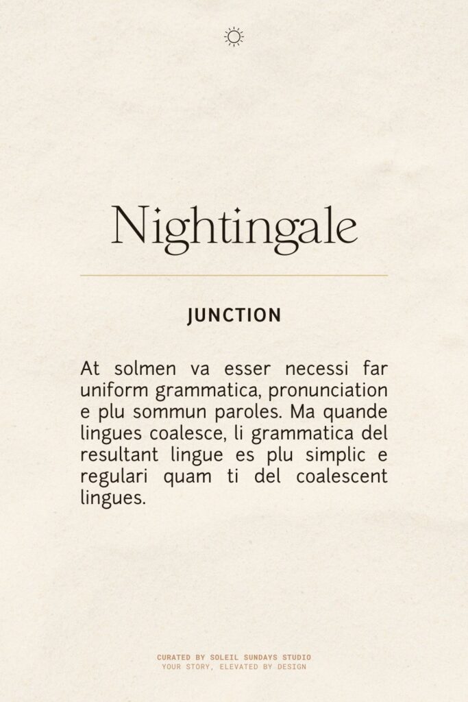
The combination of Nightingale for headlines and Junction for body text creates an intriguing blend of artistry and functionality. Nightingale, with its distinctive and decorative letterforms, brings a touch of elegance and personality to titles and headings. Its unique characteristics make it an eye-catching choice that draws attention and sets the tone for the design. Junction, on the other hand, is a versatile sans-serif font that provides excellent readability for longer passages of text. Its clean lines and balanced proportions complement Nightingale’s more expressive style without competing for attention. This pairing offers a harmonious balance between creative flair in the headlines and clarity in the body text, making it suitable for a variety of design projects.
Where to find these fonts:
Nightingale: This font is designed by Celia Yew, and you can download it here.
Junction: The first open-source type project started by The League of Moveable Type. Find it here.
4. Magnolia & Lato
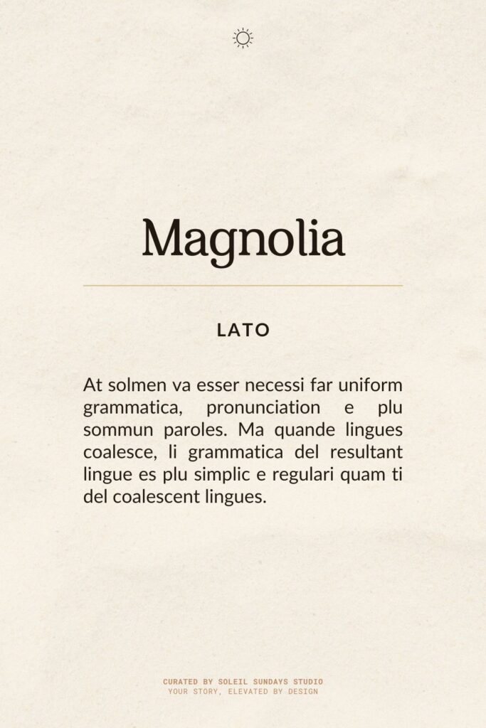
The combination of Magnolia for headlines and Lato for body text creates a visually appealing contrast between ornate elegance and modern simplicity. Magnolia, with its flowing curves and decorative serifs, brings a touch of sophistication and femininity to titles and headings. Its graceful forms capture attention and add a distinctive character to the overall design. Lato, a popular sans-serif font, complements Magnolia perfectly with its clean lines and excellent readability. Known for its versatility, Lato’s geometric yet warm forms provide a neutral backdrop that allows Magnolia to shine while ensuring the body text remains clear and easily digestible. This pairing is well-suited for designs that aim to balance a touch of luxury with contemporary practicality, such as in lifestyle blogs, fashion websites, or upscale marketing materials.
Where to find these fonts:
Magnolia: A free typeface designed by Wjatscheslaw Smesnoj. Find it here.
Lato: Download on Google Fonts.
